
Article Summary: Facts don’t sell. Stats don’t persuade. People and their stories do. Tell your competitive intelligence data story every time through the eyes of your audience. Put your message, supporting points, data, facts, and figures into a meaningful context. Make them tangible. Weave together content, interpretation, fact, passion, and a call to action into your data with storytelling. By connecting the competitive intelligence data story to your peers, managers, and executive team in their words and according to their priorities, you will increase the value of your conclusions and recommendations. Great business (data) stories do not tell us only what we should know; they tell us what we should do, and why we should do it.
[Note: I also conducted two workshops for SCIP, Data with Storytelling Workshop and “What Do You Do?” ]
Tell Your (Data) Business Story – Eight Steps to Inspire Your Audience
Copyright © 2007, The Chief Storyteller®
Ira J. Koretsky
Competitive Intelligence Magazine, May-June Issue
Ready for a quick survey? Who likes public speaking? Okay, a few of you do. Next question—who likes to attend PowerPoint® presentations? Again, a few of you do. Both responses are what you would expect, right? How would you like to change both answers to a resounding YES by increasing your audience’s interest in and understanding of your analysis?
As a former competitive intelligence professional and member of SCIP, I readily understand the challenges you face. You are called on daily to inform and empower others with data and information. As I challenged the members of the Washington, DC, SCIP chapter to start thinking like business storytellers, I am challenging you, too. Change your presentation approach from one of information sharing, into one of telling a great data story.
GREAT STORIES TRAVEL
Throughout our private lives, we experience great plays, movies, and books. The memorable ones resonate within our hearts and minds. We share them with everyone important to us. In business, people can leverage the power of stories every day. Great business stories have the same characteristics and the same potential as personal stories. They transform facts into ideas and ideas into action.
Your data story should transform facts into ideas and ideas into action. Great stories travel™
Having attended thousands of presentations, it is clear people often overlook the power of stories. The typical presenter packs the presentation with text, diagrams, and facts. He leaves the interpretation of these data to the audience. Too many people are like Joe Friday of Dragnet. They unknowingly and unconsciously follow his famous mantra, “Just the facts, ma’am.” Instead, offer an active message in which you interpret the data, form a position, and make recommendations – tell a story with your data. Help your clients make better decisions with a data story that simultaneously educates, entertains, and inspires.
EVERY PRESENTATION IS A STORY
Let me describe a typical presentation development approach with a story. One of my clients, “Robert,” is a national expert in his field. He is a presentation procrastinator. With only days to go, he would create a presentation by merging slides from different PowerPoint presentations. Robert would practice his presentation once, often the morning of the big presentation. He would design his opening on the way to the meeting, typically while driving. And would design his close during the presentation. His anxiety shot through the roof each time.
All of us have been a “Robert” at one time or another. The eight steps below offer a proven framework for creating inspiring content, engaging visuals, and thought-provoking messages. You can customize the framework to fit your specific organization, presentation style, and competitive intelligence requirements. As you become comfortable with the process, it will become easier and easier to create an inspiring presentation and inspiring data story.
Following the steps are three examples of how to turn vanilla, data-centered slides into great slides to help tell your competitive intelligence story.
1. Know your objectives
Determine the overall character and content of the presentation by asking yourself a few questions:
- Is the presentation for information sharing, making a decision, or training?
- Will our clients be using the data for internal or external purposes?
- How will our competitive intelligence information, interpretations, and recommendations be used?
- What are the next steps after your stakeholder’s hear your presentation?
2. Know your Audience
It’s all about them! Knowing the needs of the audience is the root of all great storytelling. To ensure your message is on target, ask yourself these key questions:
- Why are they attending the presentation? What do your stakeholders want to know, learn about, and discuss?
- What problems and issues are your recommendations solving?
- What are the hot buttons for them and what are they most passionate about?
- Is the audience friendly or unfriendly toward your subject?
At The Chief Storyteller ®, we developed our Analysis of Audience. This two-page form includes a variety of qualitative and quantitative questions we fill out before every presentation. You should develop your Analysis of Audience, ensuring you can confidently address the concerns and goals of your stakeholders.
“Your first ten words are more important than your next ten thousand!” — Elmer Wheeler
3. Target with the right message
Elmer Wheeler—of the famed phrase, “Don’t sell the steak, sell the sizzle”—said it best: “Your first ten words are more important than your next ten thousand!” (Tested Sentences That Sell, 1937).
Imagine reading a newspaper. What catches your attention? Compelling headlines. Imagine listening to the radio. What catches your attention? Compelling verbal headlines. Think about email. What emails do you read first? Likely the one with the subject line that draws you. Each teases you with a promise of something. Journalists know how to whet their audience’s mental appetite. We call this your Better Tomorrow Message™ (BTM™).
Your headline or BTM™ should be 3 to 10 words in length. It should blend facts, anecdotes, stories, logic, and passion.
Keep in mind, Step 3 is the most difficult of the eight steps. Be patient and take your time. It will be worth the wait. You will feel it in your whole body when you feel it is right for you. You will be saying out loud with arms stretched wide, “YESSSSS!”
The headline is followed by three short supporting sentences just like an effective elevator pitch. Your message should take less than 30 seconds to say. Why so short? Consumer goods companies have learned through billions of dollars of advertising how to open our hearts and that means opening our wallets. Think about advertising today. Television and radio spots are 15 or 30 seconds long; newspaper and magazine headlines generally range from 1 to 10 words.
Mold your answer into a compelling headline with supporting sentences and watch your presentation success soar.
4. Identify your call to action
Every successful presentation, every data story has a call-to-action. Each participant should have a clear expectation of the next steps you want to accomplish.
Examples include set up the next meeting, gather more information, practice the newly learned skills, and choose an alternative/next step/plan/test/recommendation, etc.
5. Anticipate key questions
How often have you seen a presenter “squirm” when a tough question is asked? Preempt the tough questions by incorporating as many answers as possible into your presentation. To truly make your answers to tough questions effective, include business stories for some or all of these tough questions.
6. Develop three supporting points
Use the three sentences developed in step 3 as your foundation for this step. Turn each of the sentences into sub-headlines or sub Better Tomorrow Messages™, as in a newspaper article. Each sub-headline should be 3 to 10 words long and start with an active verb.
As with your headline and BTM™, spend ample time developing these supporting points.
7. Develop content and visuals
Each of the five sub-steps below help to tell your competitive intelligence data story to the audience. As you develop the details, balance where you inform, influence, educate, entertain, and inspire. Sometimes you will be accomplishing more than one item.
- Develop the content and talking points for the three supporting points you developed in step 6. A common question is, “How much time should you devote to each part of your data story/presentation?” A good rule of thumb is 5 percent of the time for an opening, 75 percent for presenting and supporting points, 5 percent for closing, and 15 percent for questions and answers.
- Design the visuals or use slides from existing presentations. Ensure the colors are synchronized to your brand and style guide. Use images of people your audience can easily relate to and diagrams and charts they can easily understand, passing what we refer to as the 3-Second Test or the Grandma Test.
- Create an inspiring and attention-getting opening.
- Craft a powerful and memorable closing.
- Practice, practice, practice.
Facts don’t sell. Stats don’t persuade. People and their stories do.
8. Deliver your great business story
Facts don’t sell. Stats don’t persuade. People and their stories do.
Maya Angelou says it best, “People will forget what you said, people will forget what you did, people will never forget how you made them feel.”
Make your stakeholders feel important by sharing a passionate and well-crafted business data story, where the data and facts support your points, where your messages speak to them, in a way that resonates both with their hearts and with their minds. This is data with storytelling.
ENHANCE YOUR VISUAL STORYTELLING
Three generic examples are discussed below that offer insights and suggestions to enhance your visual messaging. One of the easiest ways to make great slides is to simplify the visuals as shown in the examples. When it is an important presentation or data story, I suggest using a professional graphic designer.
Tell your competitive intelligence story every time through the eyes of the audience. Put your message, supporting points, facts, and figures into a meaningful context. Make them tangible. Weave together content interpretation, fact, passion, and a call to action into your data story.
By connecting the competitive intelligence story to your peers, managers, and executive team in their words and according to their priorities, you will increase the value of your conclusions and recommendations.
Great business stories do not tell us only what we should know; they tell us what we should do, and why we should do it.
EXAMPLE 1: GOOD TO GREAT
AUDIENCE: Product Managers
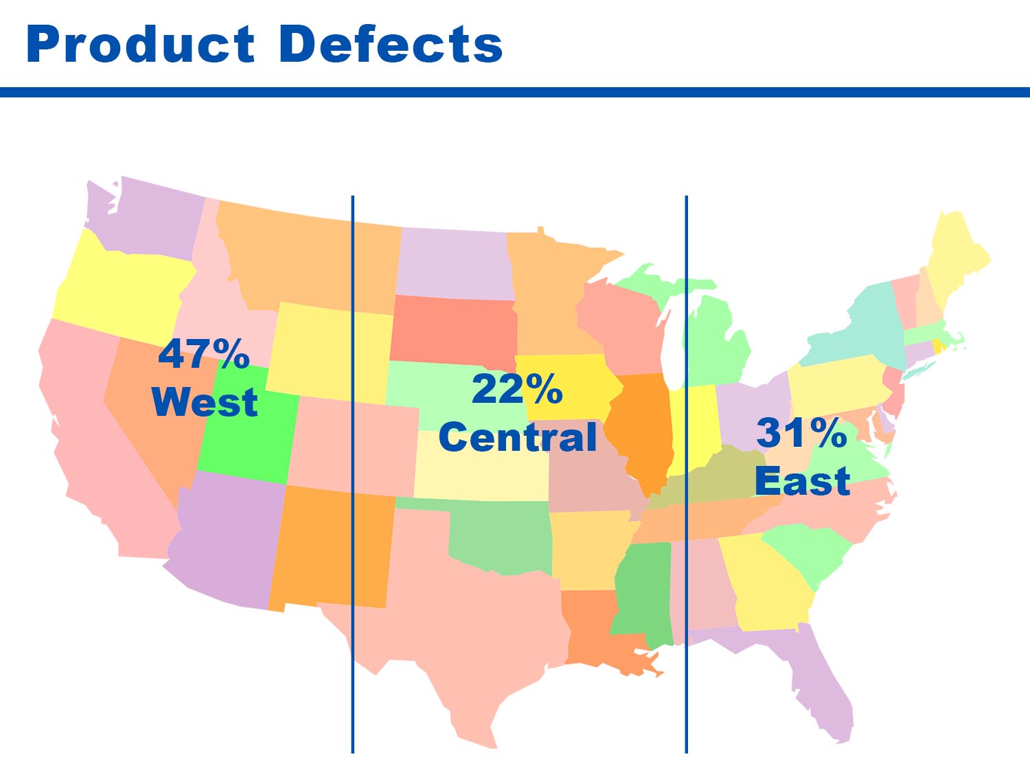
GOOD: The standard clip art map is multicolored and covers the entire United States of America. The audience will likely be distracted, and may ask questions like the following:
- What should I be looking at first?
- What data are (most) important?
- What states are in what region?
- What do the different colors reflect?
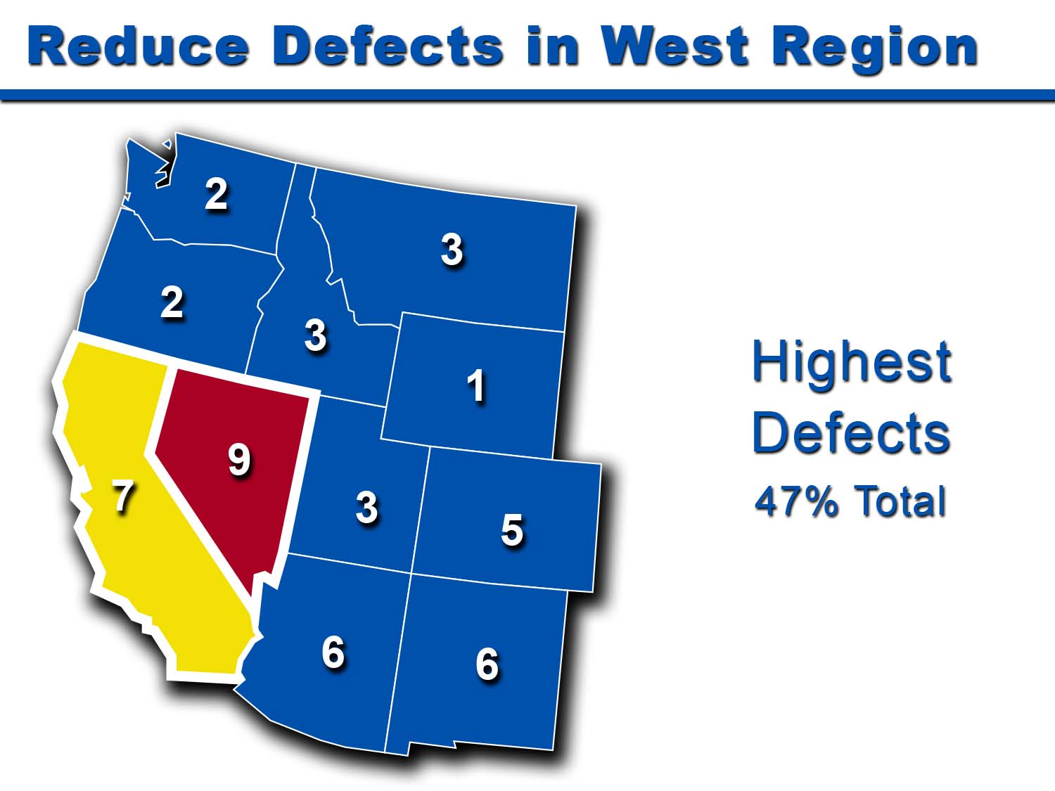
MESSAGE: Reduce defects in the west region
GREAT: Synchronize the colors to your brand and style guide (i.e., dark blue). Eliminate the central and eastern regions entirely from the slide. Populate the states with the specific numbers (leave them as whole numbers or at most, one decimal place). Leave off the percentage signs. Convert the descriptive title to a Better Tomorrow Message™ – Reduce Defects in West Region. As an option, highlight in red and yellow the two highest percentage states, respectively as well as thicken the border. Add a little shadow to the image if you like. Now the eye will be drawn to the red and yellow first, then generally the title follows. With these changes, the data story is centered squarely on the West Region and the defects within.
EXAMPLE 2: GOOD TO GREAT
AUDIENCE: In-house trainers
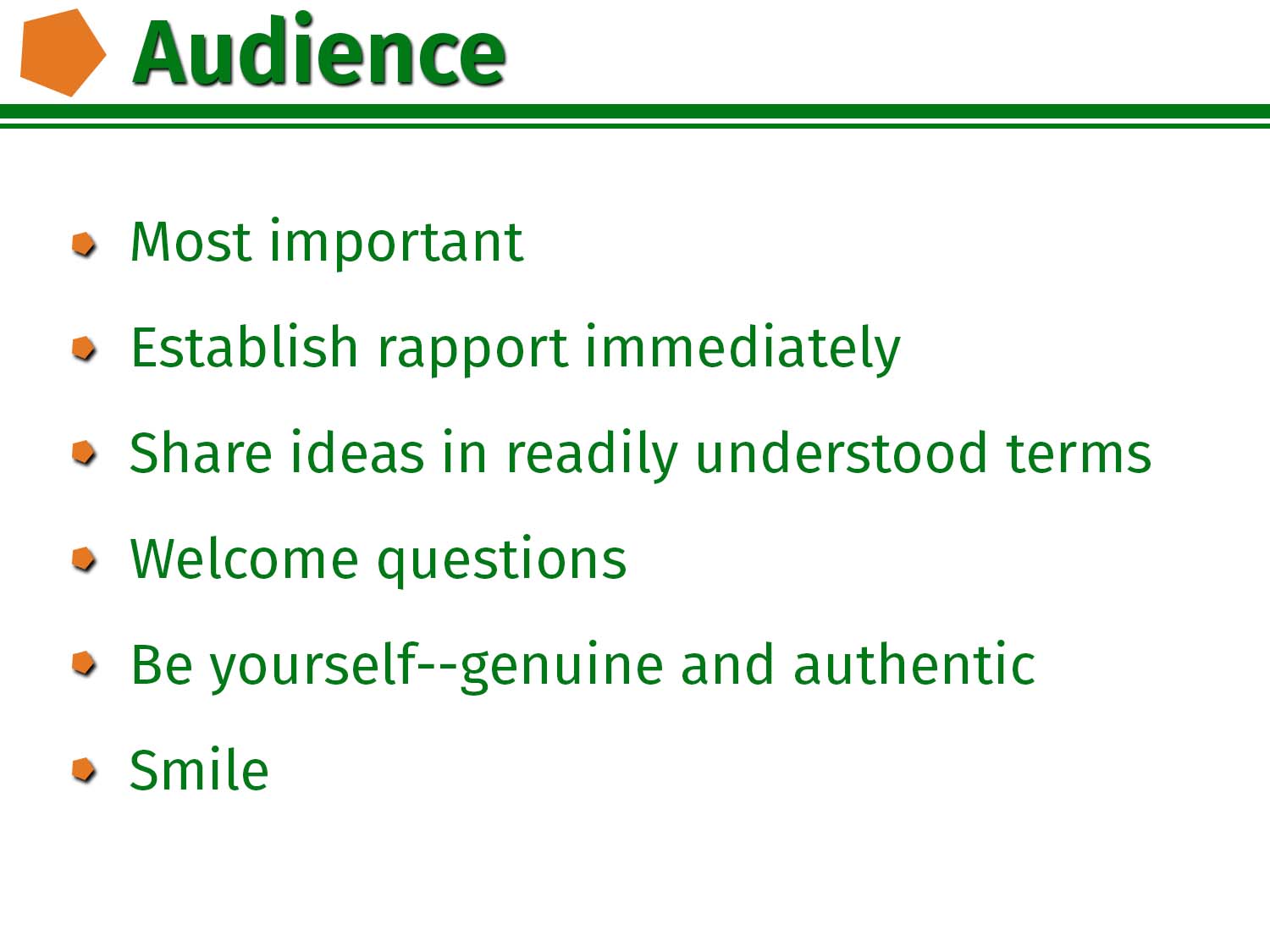
GOOD: Typical presentation options are bullet points and bullet points with clip art.
Keep your bullet points short and sweet. Remember that a PowerPoint presentation is not a teleprompter or a script placeholder. If your attendees need more details, you should provide a separate handout or workbook.
MESSAGE: Presentations must be audience centered
GREAT: In this data story example, we are turning the basic bullet slide into an interesting visual message with the use of stock photography and a Better Tomorrow Message™.
Visual messages can convey emotional qualities that dramatically increase content retention, audience connection, and message persuasiveness. The happy faces in the photography become the stated and unstated message. Audience-centered content and a positive emotional state are the keys to a successful presentation. Use colors from your style guide such as with the green overlay bar. This is the type of slide that lends itself to storytelling. With powerful visual imagery, you can tell a relevant personal or professional story that relates to the point you are making.
Source Photography: Deposit Photos

EXAMPLE 3: GOOD TO BETTER TO GREAT
AUDIENCE: Senior leadership in mid-market companies (e.g., CEO, CFO, Chief Sales Officer, Chief Marketing Officer)
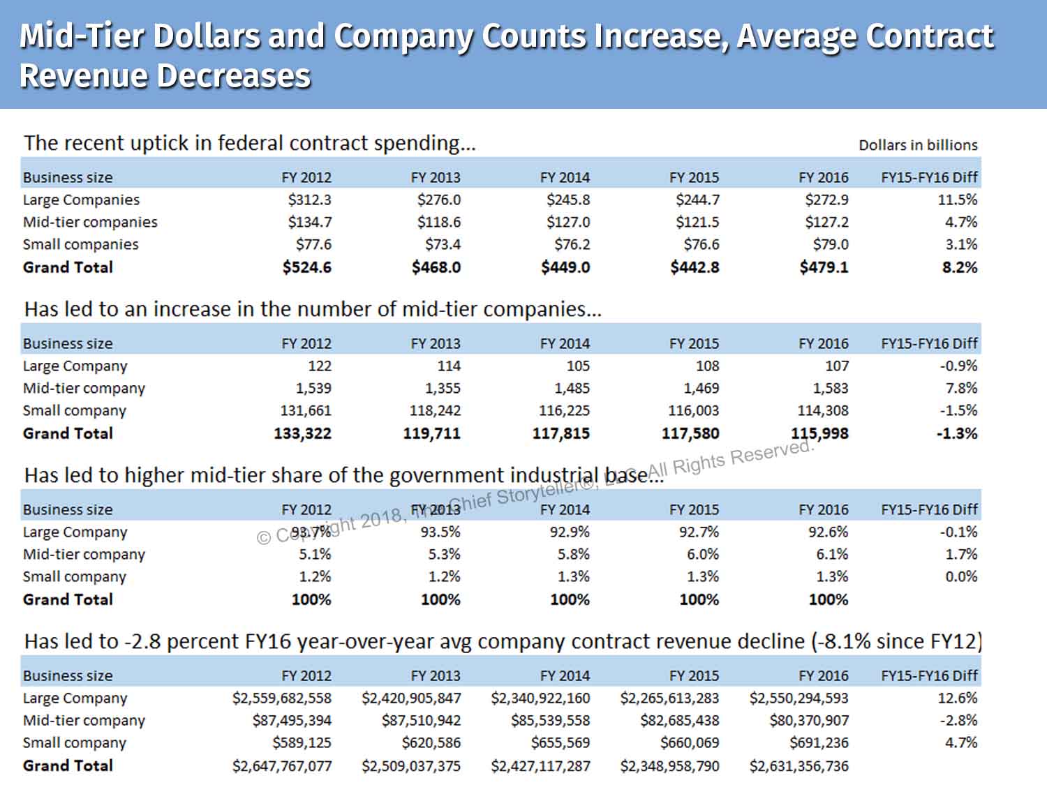
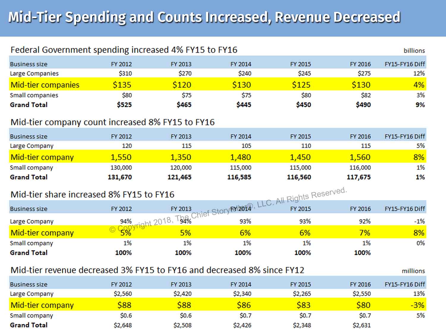
GOOD: Typical data-driven slides have charts, tables, graphs, etc. with precise numbers with one or two decimal points. This means you’ll see complete data for numbers in the millions (e.g., $87,495,394) and billions (e.g., $2,647,767,077). Typical slides are missing powerful messages and powerful Better Tomorrow Messages™.
BETTER: Assuming that context is important and you need to keep the data for Large and Small in the slide, I suggest highlighting the mid-tier row in yellow and increasing the font size. Also, I suggest rounding everywhere and reducing billions to millions in the fourth row of data to simplify the look and feel of the slide as much as possible. I changed the message format, shortened it, and added and changed the messages.
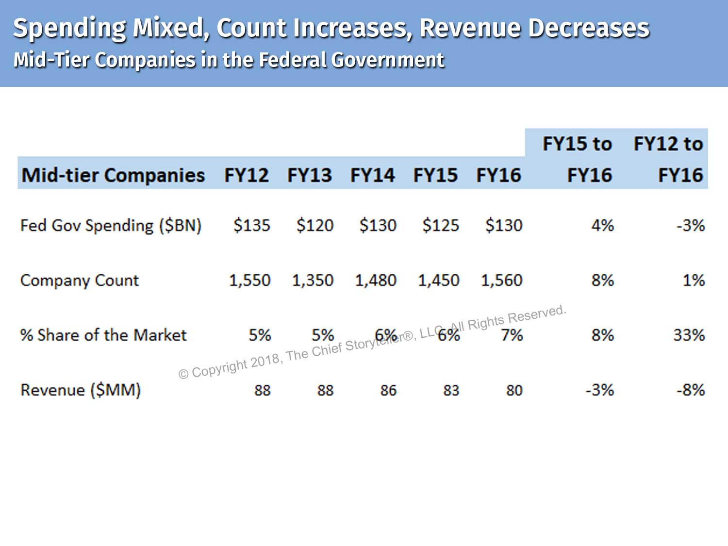
GREAT: This data story example simplifies everything and focuses the discussion on just the mid-tier companies. Every number is simplified, decimals removed, numbers rounded, column headings reduced to FY1#, shortened row labels, added a FY12 to FY16 column (i.e., for comparison as the first chart compared the bottom row to FY2012 without showing any calculations), and changed the slide title. Now the chart compares FY12 and FY15 to the current year of FY16.
Photography Source: Header, Executive from Photo Objects // Word Cloud/Message Cloud and design, All visuals, tables, and slides © Copyright 2018, The Chief Storyteller®, LLC. All Rights Reserved.
Example 3 – Good
Example 3 – Better
Example 3 – Great
FURTHER READING ON DATA STORYTELLING AND PRESENTATIONS
- Drop the Dry Presentation, Tell a Compelling Story (Part 1)
- Presenters Must Prepare Like Orchestra Conductors (Part 2)
- I Only Talk with People that Understand My Jargon (read)
- Turn Your Personal Experience into an Engaging, Powerful Story (read)
- “1-2-5-10” – Five Steps to Mastering Fundamentals of Presenting (read)
Photography Source: Figure from PhotoObjects. Message Cloud and Design, © Copyright, The Chief Storyteller®, LLC. All Rights Reserved.
#chiefstoryteller #storytelling #communication #datastorytelling #storytellingforinternalcommunication #swd


